

ABSTRACT
Looking at your run charts and distribution curves – measures of your operational and maintenance performance – can enable you to fully understand the future implications for the reliability of your plant and equipment. The author’s company provide distribution curves of your failure data and uptime as part of a maintenance audit. These curves reflect your business future, unless you change operational and maintenance management policies and practices to those that produce more successful outcomes. Read how simple, fast and easy it is to predict your future operating and business performance.
There are analysis techniques for ‘systems of components’ such as whole equipment items and even entire businesses. A common reliability prediction method for systems is the Crow/AMSAA (Army Materiel Systems Analysis Activity) plot used to show if improvements are occurring. A Crow/AMSAA plot uses past failure events to project the future. It plots known failure dates to build a cumulative graph of failure events as a line across time. The angle of the line tells if the system failure rate is increasing (upward inclined) or decreasing (downward inclined). The assumption made is that the recent past is a usable representation of the near future. If that assumption is incorrect a Crow/AMSAA plot is not trustworthy. The Crow/AMSAA technique can be applied to confirm the cause of the behaviour it reflects. Provided you make just one change and keep everything else constant for several cycles of use the angle will show the impact.
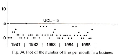
There are two other very handy and simple techniques for analysing ‘system’ reliability—the run chart and the failure distribution curves developed from the run chart data. Figure 1 is extracted from W. Edwards Deming’s book ‘Out of the Crisis’. It is a run chart of fire events in an industrial operation during the 1980s. Looking at the run chart it is clear that unless something changes, the coming year will be the same as the past five years.
The run chart confirms a persistent problem exists. The fires of Figure 1 are so repetitive that it is clear a common cause problem is built into the way the company operates—they make fires as one of their ‘products’. This place must have been endless trouble for its people and management to run.
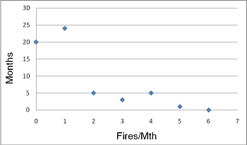
Within the run chart is ‘hidden’ information on the probability of the next fire event. Of the 58 months of data there were one or more fires in 38 of them. The odds are 38/58 (a 0.66 chance) that there will be a fire next month. Figure 2 is a distribution plot of the frequency of fires per month in the months with fires. In these 38 months with fires there were 68 fires. There was one fire per month during 24 months of the 38 (a 24/38 = 0.63 chance of one fire in a month with fires), five months had two fires (a 5/38 = 0.13 chance of two fires. In fact, there is a 0.66 × 0.13 = 0.09 chance, odds of about 1 in 11, that you will be fighting two fires next month), three months had four fires (a 3/38 = 0.08 chance of four fires in months with fires), five months had four fires(a 5/38 = 0.13 chance of four fires) and one month had five fires (a 1/38 = 0.03 chance of five fires). No months had six fires, but from past history, the possibility existed that it would happen one day.
There is more information to be seen in the run chart. The frequency and density of occurrence of months with one fire, versus the density and frequency of months with three or more fires, indicates that the months when one fire happened were not the same types of months as those when three or more fires happened. Something significantly different happened in the months with many fires.
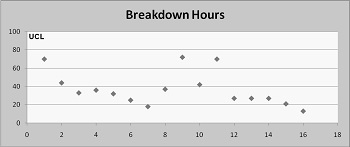
Another example of using run charts is shown in Figure 3. It is the production downtime hours caused by equipment breakdowns each week in an industrial plant.
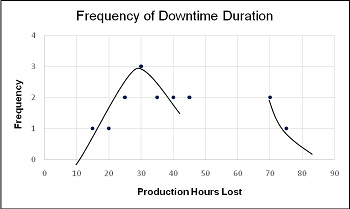
Figure 4 is the frequency distribution curve for the data. It starts to look like a ‘bell-shaped’ normal distribution curve but suddenly there is a discontinuity. This company has two types of breakdowns—the usual and the severe. The lost time from ‘normal’ breakdowns averages about 25 to 30 hours a week (consistently between 15 to 45 hours), but from time to time there are breakdowns that are catastrophic for production.
Figures 5 and 6 are an example of getting stuck trying to fix your current business when you ought to throw your troubles away and build a better business system. This business is a renowned company in its home country. It is well respected and profitable enough. But it can easily be so much wealthier. There are vast new fortunes sitting in the business, but they will never be seen by its owners and managers. They are so focused each day on trying to make their existing business processes and system work properly. It really needs their business processes to be completely redesigned and rebuilt.
The two charts cover a period of ten years of operation (we’ve disguised the dates and company). The upper run chart shows the dates and durations of all their downtime outages. The bottom plot is the uptime frequency distribution curve derived from the run chart (I call it a ‘chance-of-success’ chart). This business is profitable but missing a lot of free, extra operating profits that would be banked if they had high uptime (worth several million dollars a year to this company). See how the frequency distribution curve turns the splatter of events in the run chart into a clear message about this company’s chance of uptime success. This is an example of using ‘Big Data analysis’ to find new opportunities already sitting and waiting in your business.
In Figure 5 you can see a run chart for ten years of outage history. Look at the density of the dots. There were years of frequent trouble and times of less. The last two years show fewer minor trips and some of best uptimes. Note the stratification of dots; many below 50 hours outage and far fewer above. The periods of uninterrupted production (the times between outages, i.e. the uptime) were identified and Figure 6 is a distribution curve of them. The shape of the curve tells a lot. There are dozens of short duration running periods less than two days long, quite a few periods from two to ten days, very few uptime periods longer than twenty days.
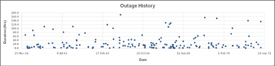
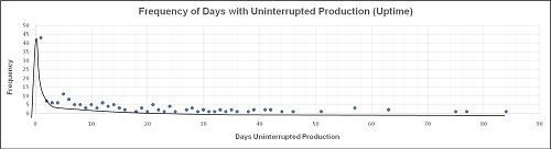
The whole area under the fitted-by-eye curve in Figure 6 is the probability of plant uptime. You can estimate by eye that the area between 0 and 20 days is larger than the area from 20 to 80 days by about four times as much, i.e. it is four times more likely that the next plant outage will be less than 20 days away than it will be more than 20. And it looks about three times more likely that an outage will happen in less than ten days rather than longer. It is clear from the ‘hump’ in Figure 6 between 0 to 2 days that its causes are creating a big problem for the business. It would be very valuable to analyse the reasons for the outages in the ‘hump’ to learn what is producing so many stoppages.
To do useful root cause analysis of your distribution curves, it is vital to know the reason for each data point. Once you have a distribution curve of known causes you can identify the impact of each event. If the same cause keeps occurring the business-wide losses from it will justify starting an improvement project to solve the problem. Once the problem is removed the moneys that were once lost to stoppages become new operating profits. Our recommendation is to keep full and complete records of your production and maintenance problems—they are worth solid gold to you in future.
The shape of the uptime frequency distribution curve tells you a lot about why this operation is suffering from high maintenance costs and poor availability. The clustering of results along a definable downward curve tells us there is a destructive process at work within this company. It has an in-built outage-causing process, surely unintentionally introduced, that produces these poor uptime results. The early failure peak is an indicator of poor business process quality control—there are lots of defects sitting in their business waiting for the chance to go wrong. The negative slope of the curve means that their current designed and intended processes can never get them to the production performance they want, which is 60 days uninterrupted production uptime between outages. That has happened only five times in ten years. Those five successes were all down to luck, which you know because the 60-day uptime events are clearly unrepeatable, they are random events. The only sure thing in this business is that uptime has a very great chance of being less than twenty days, some chance of being up to thirty days, and they will be very lucky if they get near to, or more than, sixty days (about a 10% chance).
The maintenance and operational processes they use can only deliver the current uptime results you see in the plots. Remember, this is ten years of real production data—this performance is what they actually get from their business. Until they change to reliability creation processes that guarantee the success they want, their future operating performance and losses will be the same as in the past.
If this was your company one of my own organisation’s consultant partners would redesign and rebuild business-wide, life-cycle long, holistic reliability creating processes that moved the production uptime chance curve to a high certainty of getting sixty days uninterrupted production. They use unique, proprietary ‘big data’ analysis and process modelling methods and software so that you get the simplest, least-cost ‘system-for-success’ that delivers the world class maintenance, reliability and operational excellence results you want from your business. With such change come commensurate increased operating profits and new competitive successes – a high return on investment.
To be successful you need a business system designed for creating sure success. If you want the utmost uptime, throughput and productivity at least cost, your business processes must be designed and run to give you that result. Having a successful industrial operation with world class performance is a purposely designed intent; the result is not a matter of chance and luck.
First you need to design and build your operation into a ‘system-of-reliability’.
What is a ‘system-of-reliability’? Reliability is most simply defined as ‘the chance of success’. When your business is a ‘system-of-reliability’ it uses the best methods and practices guaranteed to maximize your operating performance; you select the optimal ways to make the most operating profit and engineer them into your business processes—you literally will build a ‘business-system-designed-for-utmost-success’. But you must build a system. It cannot be done in any other way.
It’s why we advise not to adopt Lean or Six Sigma unless they are first proven to be the right answers to your problems. If you use them as point solutions Lean and Six Sigma initiatives always fail to bring lasting success. Point solutions are totally ineffective for creating operational excellence that lasts forevermore.
As a ‘system-of-reliability’ there is no limitation on your company reaching world class maintenance, reliability and operational performance. Your day-to-day struggles disappear in just a few months as you turn your company into a set of processes that creates the world class reliability you need for world class operating performance, which is the natural outcome of these processes. Your operational excellence success is a realistic goal that can be surely achieved by building a business-wide, proactive, life-cycle long, ‘system-of-reliability’.
The author’s organisation uses lifecycle and system-wide solutions to fix the causes of your problems; not point solutions that just address the symptoms. You get simple, quick to implement, effective system-wide answers. The exceptional return on investment you receive comes from your new ability to:
- Measure the important factors that really drive successful reliability, maintenance and operational performance
- Make work error-free and defect-free so only right-first-time quality is achieved
- Eliminate nine out of tenof your equipment breakdowns
- Keep your plant and equipment always operating at 100% capacity during scheduled production
- Deliver record high plant availability and uptime never seen before in your operation
- Get your production plant processes totally in statistical control and 100% capable all the time
- Improve your workplace safety results to world class performance
- Drive maintenance costs down rapidly to world class ratios
- Eradicate your production waste, quality losses and scrapped work
- Produce the lowest unit cost of production possible from your operation
- Sustain lasting world class maintenance and reliability performance
Plant run charts are more than simply indicators of the dates when there were problems in your plant or with your equipment. They contain knowledge of the future likely behaviour of your operation. That behaviour is the cumulative effect resulting from operational and maintenance management policies and practices. The natural behaviour of your operation is seen in the distribution curves generated from the run chart data.
Once you have distribution curves you have a means to monitor your operation’s performance. Each change you make will produce a new dot. When it is superimposed on the past distribution curve you get immediate feedback on the business performance impact. If your change did not produce a better result, you need a better solution. When the author’s organisation carries out a maintenance audit or maintenance management audit, run charts and distribution curves are featured in the report. They help to target the causes of problems. They are especially powerful in identifying the impact of current practices on future productivity and financial performance. They help to justify making serious and deep improvements to your business and operating processes so that you rapidly lift profitability.
All the very best to you and your company’s future
To contact the author: Mob.: +61 (0) 402 731 563