

 ABSTRACT
Of great importance to anyone who operates high-value assets is to know when they need maintaining. Further, to know ahead of time, with plenty of time to optimise the maintenance and cause the least amount of disruption to the operation, would be highly desirable. This is the goal of prognostics. Just like going to a doctor when you begin to feel poorly with a set of symptoms, you want to know what is wrong and when you will have recovered and can get back to everyday life. It is the same with equipment. If the equipment’s vital signs are continuously monitored, producing the symptom vector, then analysis can, first, tell what is wrong and, second, offer a prognosis as to what time it needs to be fixed by in order for it not to fail completely and cause secondary damage and operational interruption.
In thinking about this process, the so-called P-F curve is used to explain what is going on, and what can be done, in more detail. As this is often misunderstood, or options not visible because of not being aware of it, this article explains the curve, talks about what timescales may be encountered in using it, and what can be done to give as much warning time as possible. It discusses how the concept of Integrated Vehicle Health Management can be applied.
If the health of a component is monitored against time, and degradation starts, ultimately progressing to failure, the graph shown in Figure 1 can be used to depict the process. This article is not going to address how to measure the health of a system, or what prognostic algorithms are used, but rather will address the overall P-F concept.
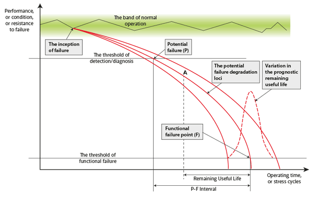
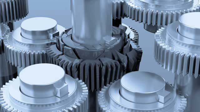
Initially, the condition of the component or system is good (remembering that from the first time the asset is used it will start to degrade), but at some point the condition starts to degrade noticeably: for example, the surface of a gear tooth wears to a point that it causes vibration. This is the inception of failure in Figure 1, and the degradation continues until the phenomenon can be detected: this is the point at which potential failure is recognised (point P on the P-F curve).
The degradation continues until the point of functional failure is reached (point F in P-F). This gives the Potential to Functional (P-F) time interval, the time that can be given by an alert capable of sensing the degradation. For any action to be possible, and the monitoring to have been useful, the P-F interval must be long enough to allow maintenance action to be taken.
As degradation progresses away from point P the time left until functional failure is called the Remaining Useful Life (RUL). The RUL at an arbitrary time, corresponding to point A on the curve, is indicated on the diagram. It is the job of prognostic algorithms to predict the RUL, a job that varies in complexity depending on the asset being examined. The curves in Figure 1 further recognise that the process of degradation is not deterministic and some variation in the remaining useful life is to be expected.
In order to understand the timescales involved in the P-F curve, and possible actions, it is necessary to introduce the concept of Integrated Vehicle Health Management (IVHM). This is illustrated in Figure 2, where the IVHM system is on the right-hand side of the figure, denoted by the sequence: sense – acquire – transfer – analyse – act [Jennions, 2011].
IVHM feeds information (processed data) on asset health into the operations or management control centre. Here, decisions will be made on maintenance actions to be taken with knowledge of the supply chain status and MRO loading, provided from the maintenance and logistics systems shown at bottom left.
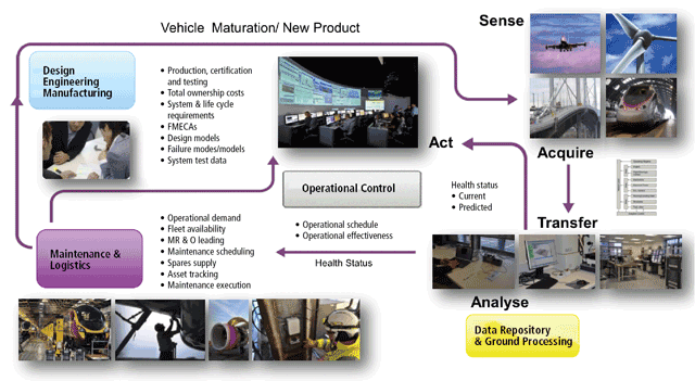
(Design is shown to complete the picture. Occasionally a redesign is required to correct a fault seen by the IVHM system but, more often than not, the design of the next-generation asset refers to the in-service data collected by the IVHM system (bottom right). This data will inform designers as to what went well with the last design and what should be corrected on the next.)
The IVHM sequence starts with data about the asset being collected. Sensors are placed according to experience, guided by a failure mode effects criticality analysis (FMECA), service reports, and current design challenges. It is important that sensors be placed with a purpose, as the amount of data provided to downstream systems can pose a significant challenge, and there is a strong need to know how to interrogate the data once it comes off the asset.
Data is captured locally and usually transmitted to a central site for analysis. The very significant reason for centralised analysis is that it enables understanding of the fleet as well as the individual asset, with planning of corrective action. This allows problems seen in one or two assets of a large fleet to be closely watched in the remainder of the fleet and early intervention taken.
From the analysis, information on assets requiring attention is then transmitted to the operations centre. It is not unusual for this whole process to take very little time (an hour or less), with the analysis algorithms being tuned as new data appears.
If we now combine the P-F curve with the idea of IVHM, Figure 3 can be drawn. Here, the P-F interval is plotted against the impact or consequences of a failure, the figure coming from consideration of an aircraft engine. The impact can be one of the four kinds shown and, projected against time, results in a number of areas, each quite different, appearing on the chart. Note that the time axis is highly non-linear.
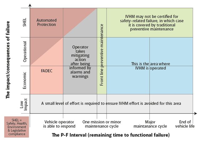
With IVHM mapped on to this diagram, the distinction between automated safety systems and active health management can be seen.
At the low impact level it is important for a maintainer not to be spending time fixing physical failures that may not affect the functioning of the asset, for example a bolt may be broken on a North Sea wind turbine but it is not necessary to go and repair it unless it is affecting the function of the turbine. This needs to be avoided as it consumes resources to no real end.
The other impact categories are as follows. The economic impact is straightforward in that the functional failure only causes a monetary concern, while operational impact causes disruption to the service being offered, both involving customers and costing money. The highest impact level considered here is Safety, Health, Environment and Legislative Compliance (SHEL), which would include events such as a rotor disk burst.
If the areas to the left of one mission or maintenance cycle are examined it is seen that this is the domain of the control system. Times are so short that an automated response is necessary both for safety (automated protection) but also for economic and operational impact cases, with a division between FADEC (full authority digital engine control) and operator intervention after alarms are sounded.
To the right of this line warning times are longer, and benefits from IVHM-type monitoring systems for the slow degradation processes described above can be found. At the level of SHEL, IVHM type systems have not been yet certified and there is much discussion as to how this area will be addressed in future. The area where IVHM is most effective, and the ideas from the P-F curve mostly apply, is the longer scale effects impacting on the operation and economic categories. Although this example is for aircraft engines it can, in principle, be applied to any complex high-value asset.
Having considered timescales and likely responses it is only natural to ask if, somehow, time can be bought. The answer to this question is undoubtedly “yes” and is illustrated in Figure 4. Here the case of oil debris analysis is considered, oil being rather like human blood in giving us a lot of information about the condition of the asset, or body, through which it flows. Debris analysis is used to detect worn components and, potentially, where in the asset they are located.
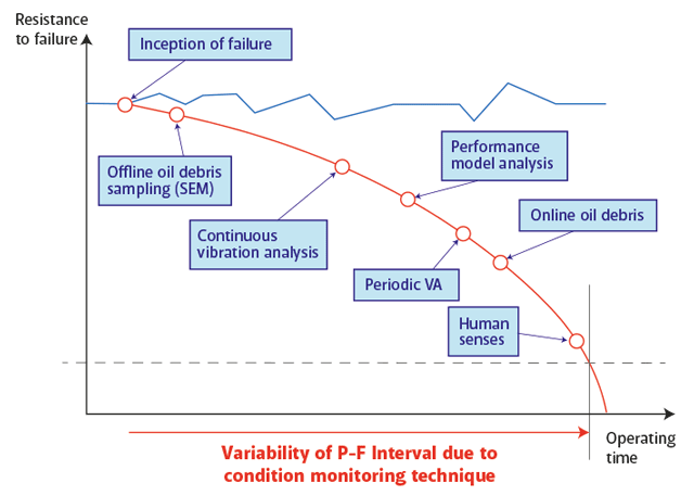
In Figure 1, point P was the point at which degradation could be detected. Figure 4 shows how this point varies depending on the technique that is used. The most accurate technique is to use a scanning electron microscope, but care must be taken because the time to get the sample to the laboratory, and the results back, have ultimately to be taken into account. The spectrum continues with vibrational analysis and performance measures, finishing with the human who senses vibration, but perhaps too late.
Overall, the P-F interval can help us think about a number of aspects of the asset’s design and operation. In the design phase, if the correct sensors are not fitted to detect degradation, the information to aid maintenance will not be given, or be given too late. When the asset is deployed, by far the longest period of its life, effective maintenance can only be provisioned with the data from such sensors, and retrofitting them is very expensive.
Though these aspects are becoming more appreciated, especially by those whose job it is to provide services, we still mostly live in a product-driven world. This will change in the future as capabilities like IVHM are proven to reduce maintenance and operational disruption costs in those industries that are far-sighted enough to be early adopters.
Reference
Jennions, I.K., editor, Integrated Vehicle Health Management: Perspectives on an Emerging Field, SAE book, 2011,
ISBN 978-0-76890-6432-2.
 Prof Ian Jennions
Director,
IVHM Centre,
Cranfield University